
Three pattern-blocking moves I use to tame stripes, florals, and checks without buying a new wardrobe.
The seam rule for stripes and checks
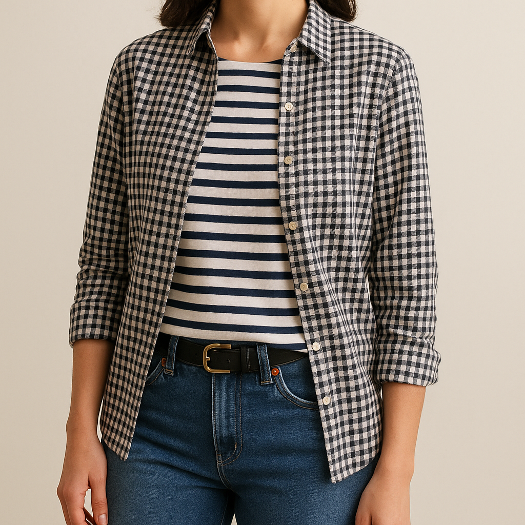
When people say they “can’t do” stripes, it’s usually not the stripe. It’s the collision. Two different stripe directions hitting each other right at your midsection can read like your outfit got scrambled in the dryer. My fix is boring in the best way: block patterns along seams, not across them. If I’m wearing a striped top, I keep the next patterned piece either (1) below a clear break like a waistband or (2) separated by a solid column that has its own edges, like a denim jacket left open or a cardigan with a clean placket.
Here’s an outfit I’ve repeated enough to know it works: a navy-and-cream Breton tee, medium-wash straight jeans, and then a small-check layer on top, like a black-and-white gingham button-down worn open as an overshirt. Notice what’s happening: the stripe lives on the torso, the check lives on the outer layer, and the seams and opening create a frame so your eye isn’t forced to “merge” the prints. If you button the gingham closed, the same pieces start arguing because the patterns are now sharing the same flat plane.
A couple of specifics that matter. Keep the scale different: wide stripe plus tiny check reads deliberate; wide stripe plus wide plaid reads like you lost a bet. Also, pick one shared color so the mix has a handshake. Navy stripe with a navy line in the plaid. Black stripe with a black check. I don’t chase a perfect match, but I do want the dark to feel like it belongs to the same family as the rest of my hardware (belt, bag strap, shoe color). If you want the easiest version, make the “bridge” a plain tee or a solid layer, then let the stripe be the only pattern touching skin. That one tweak makes stripes look like a choice, not a risk.
Print sandwiching with a calm center
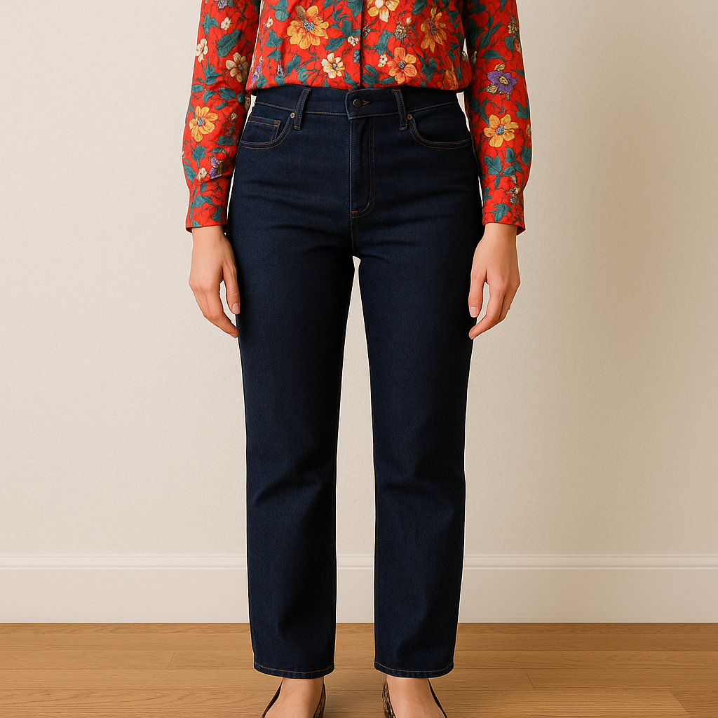
I call this the print sandwich because it sounds like lunch and because the structure is the whole point: print, solid, pattern. The middle “calm” piece is what keeps the outfit from looking like you got dressed in a moving car. It can be a trench, a blazer, a chunky sweater, or even just a high-rise jean that creates a big solid block between a top and a shoe. The goal is to make the motifs feel like they belong in different rooms of the same house.
Try it with pieces you probably already own. Floral blouse (busy, colorful), dark straight-leg jeans (the calm center), then a patterned shoe that echoes one color from the top. A leopard flat that picks up the warm tones. A black-and-white stripe sneaker if the blouse has black in the print. I do this with scarves too: if my top is patterned, I won’t add a patterned scarf right on top of it. I’ll put the scarf over a solid coat or a solid crewneck, then let the blouse peek out at the cuff. It’s still pattern-on-print, but it’s separated by fabric and distance, so it reads styled instead of stacked.
The part people miss is proportion. Your calm center has to be big enough to do its job. A skinny belt is not a calm center. It’s a thin line that just points to where the chaos meets. A medium-wash jean, a camel coat, or a black midi skirt is a calm center because it’s a real visual field. If you’re smaller-framed, you can still do it, but keep the patterns to the edges: a printed blouse and a printed shoe, with the solid piece owning the majority of the silhouette.
One more trick that saves me when I’m tempted to add “one more” interesting thing: keep the textures quiet. If I’m doing florals and leopard, I’m not also adding a heavily distressed bag and a high-shine patent boot. I want the motifs to be the conversation, not the whole room talking at once.
Borrow one color, change the pattern type
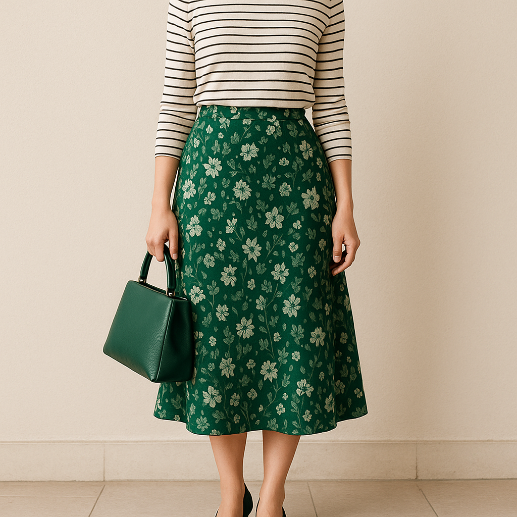
When I’m mixing prints and I want it to look grown, I don’t try to “match” them. I borrow one shade and I change the pattern type. That means if one piece is organic (floral, watercolor, animal), the other is geometric (stripe, dot, grid). It keeps your eye from trying to compare two similar kinds of busy. Two geometrics can work, but they feel sharper and more graphic, and you have to be more intentional with scale. Organic plus geometric is friendlier.
A combo I’ve worn to death: a green floral midi skirt and a cream top with thin black stripes. The borrowed color isn’t the obvious one. I pull a deep green out of the skirt and repeat it in my shoes or bag, then the stripe top acts like structure. If you don’t have a stripe top, a micro-dot works the same way. Small dot reads almost like a texture from a few feet away, so it can sit next to a loud print without fighting for attention.
Here’s the specific move that makes this feel polished: pick the borrowed tone from the background, not the loudest accent. If your floral has a red poppy on a navy background, repeating the navy will look calmer than repeating the red. Then keep the other print low-contrast. A navy-and-cream stripe, not rainbow. A black pin dot on white, not multicolor polka dots. This is also where neutrals do heavy lifting without being boring. A houndstooth jacket in black and white can sit over almost any color print because it’s basically a graphic neutral, especially if the print underneath has black somewhere in it (even a tiny outline).
If you’re standing in front of the mirror and it still feels loud, don’t yank the whole outfit apart. Cover one motif with a solid layer and keep the other two elements. Or swap the second print for a textured solid like a ribbed knit or a denim shirt. The nice thing about borrowing one hue is that it survives edits. The outfit still makes sense, even when you tone it down mid-morning because you suddenly remember you have a meeting.