
Three culture-forward pattern moves I wear in real life: Ankara with denim, Navajo pearls with a tee, and a coral red lip that doesn't fight your print.
Ankara + denim, the outfit that never feels like a costume
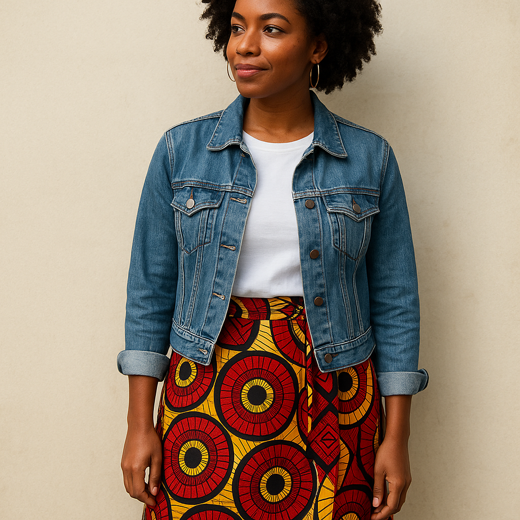
The first time I wore Ankara in public, I overdid it. I had a wax-print skirt, a bright top, and earrings that clinked when I turned my head. It read like I was trying to prove I understood something instead of just wearing clothes. The fix wasn't "tone it down" in a vague way. It was choosing one anchor that could handle the volume of the print, and for me that's almost always denim.
Here's the combo I keep coming back to: a wax-print wrap skirt or wide-leg trousers with a plain white tee and a faded blue jean jacket. The jacket matters because it has its own history, texture, and little imperfections. It doesn't compete with the pattern, but it also doesn't disappear, so the outfit feels intentional instead of precious. If I'm doing an Ankara blouse, I flip it: straight-leg jeans, simple belt, and a shoe with a clean line (loafers, white sneakers, or a low block heel).
A couple of small details make this work in real life. Wax-print cotton is crisp and it holds a shape, so I don't tuck it the way I would a slinky blouse. I either do a small front tuck that stops before the side seams, or I leave it out and let the hem be the point. I also keep my jewelry on a shorter leash: one pair of hoops or one cuff, not both. When the print is doing big geometry, I avoid other busy geometry. And if you care about not looking like you raided a themed rack, pay attention to scale: a medium-to-large motif reads modern with denim, while tiny repeated motifs plus a frilly silhouette can drift into "Sunday best" fast.
The cultural piece here isn't performative for me, it's practical respect. I buy from makers who can tell me where the fabric came from and who sewed it. If I can't trace it beyond a random marketplace listing, I pass. That's not a purity test, it's just me trying not to build my wardrobe on somebody else's sloppy knockoff of somebody else's heritage.
Navajo pearls with a plain tee (and why I skip the tiny layers)
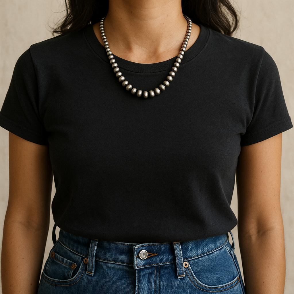
I used to think I wanted the delicate, barely-there necklace stack because that's what every styling guide pushes. Then I tried Navajo pearls (the silver bead strands) and realized the whole point is the weight and the presence. A good strand doesn't need help. If you pile three tiny chains on top, the beads start to look like a costume accessory instead of jewelry with lineage.
My go-to way to wear them is almost aggressively plain: a soft black crewneck tee, straight jeans, and one strand that sits around collarbone to mid-chest. No other necklaces. If the strand is longer, I let it hang and I keep the neckline simple so it doesn't get caught in a V that makes the beads twist. If I'm wearing a button-down, I unbutton to where the beads land and stop. You can feel when it clicks because the silver sits flat and you stop fussing with it.
What makes this a pattern move, even though it's "just silver," is how it plays against texture and repeated shapes. Those round beads become the repeat. That lets me wear a busier print elsewhere without feeling chaotic: striped tee, plaid overshirt, or a small-scale bandana. I keep the print scale smaller when the beads are larger, and I go bigger on print when the beads are petite. It's the same balancing act you do with color blocks, but you're doing it with shape and shine.
A few practical notes from owning and wearing these: they pick up hair products and sunscreen residue faster than you'd expect, so I put them on last. And I'm picky about sourcing. I don't rely on a "stamp check" to authenticate anything because stamps can be copied and not all makers stamp every piece. If I'm buying, I buy from established Native jewelers, reputable shops that can name the artist, or directly at markets where the work is attributed. If the listing is vague and the price feels like a too-good-to-be-true shortcut, I treat it like one.
When I want the look to feel even more grounded, I add one turquoise ring or a simple sterling cuff, but only if the shapes match. Round beads plus a sharp, spiky statement ring is where it starts to look like I got dressed in the dark.
Coral red lipstick that survives loud prints
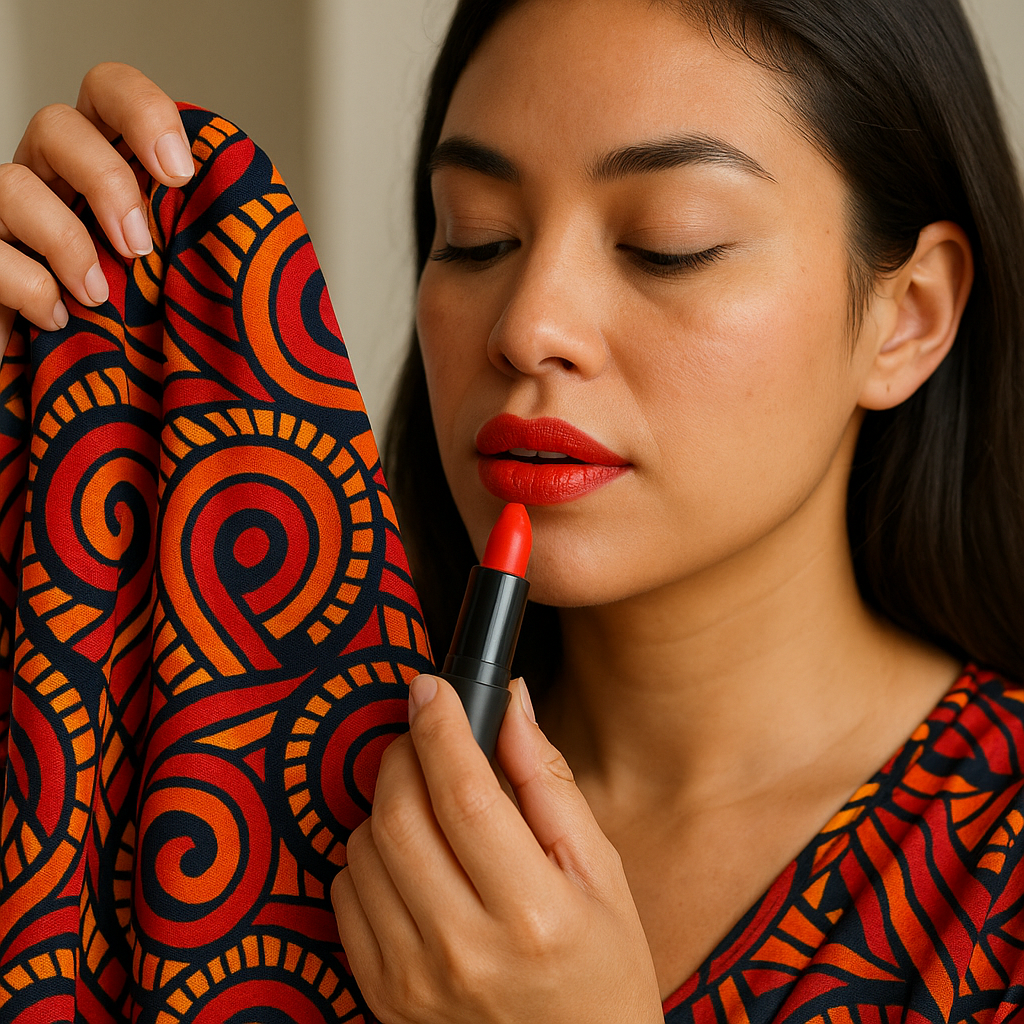
If I'm wearing a print with cultural roots I care about, I don't want my makeup to look like an afterthought, but I also don't want "full beat" energy at 2 p.m. on a Tuesday. The move that's saved me the most is coral red lipstick. Not blue-red. Not brick. Coral sits in that warm zone that plays nicely with a lot of palettes: Ankara oranges, Caribbean-inspired brights, Mexican embroidery colors, even classic red-and-navy bandana tones.
The trick is picking a coral that matches the undertone of the print, not your skin alone. I hold the garment up near my face in daylight and ask one simple question: does this print lean tomato/orange, or does it lean berry/magenta? If it's tomato, coral is safe. If it's berry, I go for a more rose-red so I don't look like my mouth is a separate outfit.
Application matters more when you're pairing it with pattern because any sloppiness reads louder. I do a thin layer, blot, then a second thin layer. If I'm using a bullet lipstick, I press it in with my finger at the edges instead of over-lining. If I'm using something long-wear, I keep balm off my lips for 10 minutes before applying so it can set. And I don't pretend it's indestructible. I bring the tube and touch up after something oily, because prints and shine already create a lot of visual movement, and a half-faded lip looks messy fast.
My most-worn corals are classics for a reason: MAC "Lady Danger" when I want bright orange-red, and NARS "Heat Wave" when I want something punchy but not neon. Drugstore can be great too, I just swatch because corals swing wildly. I keep the rest of my face quiet: brushed brows, a little mascara, and blush that echoes the lip instead of fighting it. The only time I add more is when the print is high-contrast black and white. Then a sharper liner makes sense.
One last thing I learned the hard way: if your outfit has multiple strong colors, don't try to match the exact shade in your lipstick. Pick a neighbor shade. That small offset is what makes it feel styled, not like you bought a "set."