Three ways I keep loud prints wearable: the shoe test, the bag-as-break trick, and an earring move that won’t fight your top.
The 10-foot mirror test for printed shoes
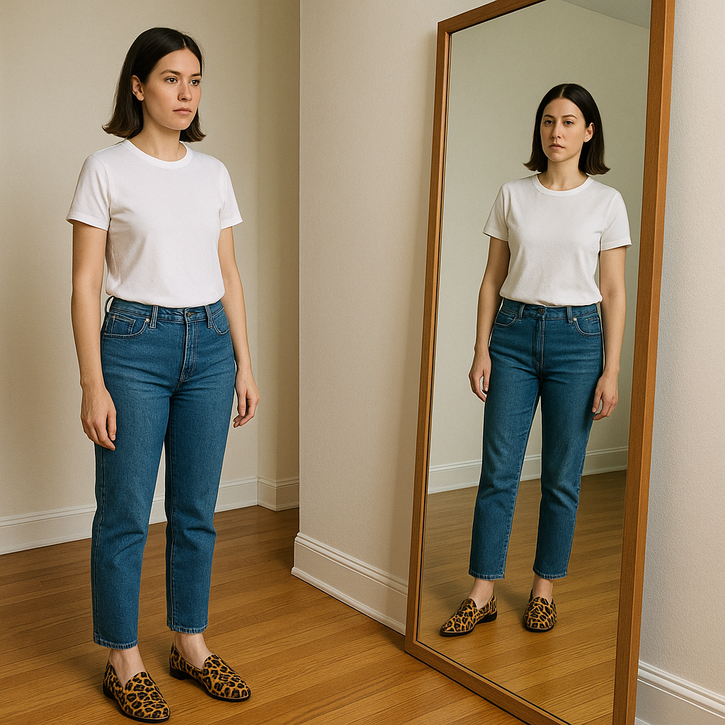
I learned this the hard way with leopard loafers that looked fun at my vanity and then, in daylight, looked like they were leading a parade. If you want to accessorize with bold patterns and not feel like your outfit is just a backdrop, you have to check scale and contrast at the distance other people see you. Here’s the routine I use now: put on the shoes, stand about 10 feet from a full-length mirror, and take one step forward. That tiny movement is the tell. If your eyes jump straight to your feet and stay there, the print is the star and you need to quiet everything above it.
The easiest way to do that is to give the rest of the outfit one clean field of color. Think straight-leg denim with a white tee, a black column dress, or a simple tan trench. I’m not trying to match the print, I’m trying to give it negative space. With black-and-white checkerboard Vans or a snakeskin boot, I avoid tops with visible texture (chunky knits, heavy slub, loud ribbing) because the shoe already has visual noise. Smooth cotton, crisp poplin, or a fine merino reads calmer.
One more detail that matters: the sock line. A bright sock or a high-contrast ankle strap creates a second break and makes the shoe print feel busier than it is. If I’m wearing a patterned shoe, I either go no-show or pick a sock that disappears into my skin tone or the pant hem. It feels fussy while you’re getting dressed, but the outfit looks more intentional in every photo afterward.
Let your bag be the break between prints
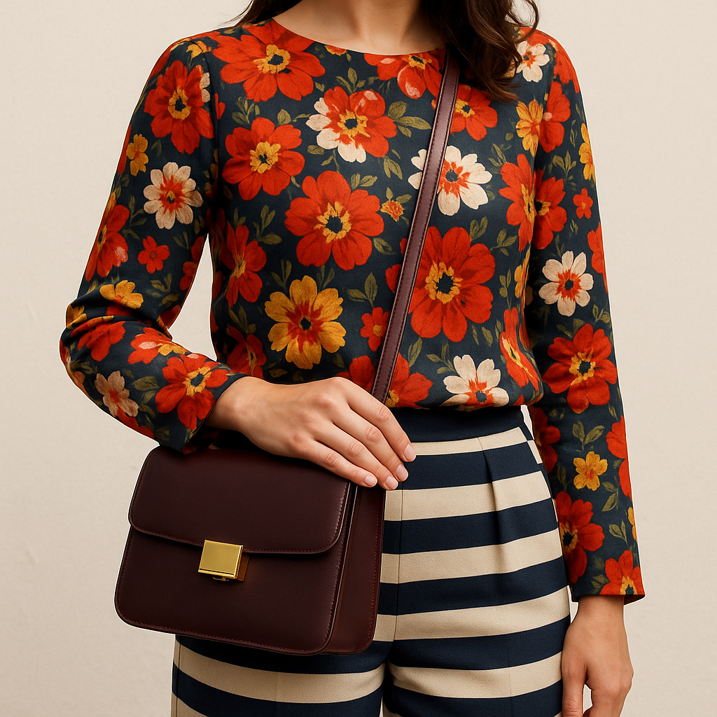
When I’m wearing a loud top, my first instinct used to be keep the bag neutral. That’s not wrong, but it’s incomplete. The bag isn’t just an add-on, it sits right in the middle of your silhouette, and you can use it to separate prints so they don’t blur together. This is my favorite move when I’m in a patterned blouse (say, a floral or stripe) and I still want a second bold moment somewhere else, like a printed shoe or scarf. I put a solid, structured bag between them so your eye gets a pause.
The trick is choosing a bag that reads like a clean shape, not another texture. A pebbled leather that’s super grainy can look busy next to a high-contrast print. I reach for smooth leather or coated canvas in a single color. If I’m doing high-contrast pattern up top (black-and-white, navy-and-cream stripes, graphic dots), I like a bag in a deep, boring color that has some weight: oxblood, espresso, ink navy. A classic Coach Tabby-style silhouette, a simple crossbody, even a plain tote with sharp edges works because it’s more geometry than “look at me.”
Where it lands matters. Crossbody straps cut across prints, which can be great if you want to break up a big patterned field, but it can also create a messy diagonal if the print already has directional lines. With stripes, I usually carry the bag by hand or on one shoulder so I’m not adding an extra slash across the torso. With florals or abstract prints, crossbody is fine, and I’ll adjust the strap so the bag sits at hip bone level. Too high and it blocks the best part of the top; too low and it looks like it’s dragging the whole outfit down.
This is also how I keep mixed prints from turning into costume. I don’t try to make the prints talk to each other. I give them a referee: one solid bag, clean hardware, no fringe, no tassels, no extra storyline.
Statement earrings that won’t fight a patterned neckline
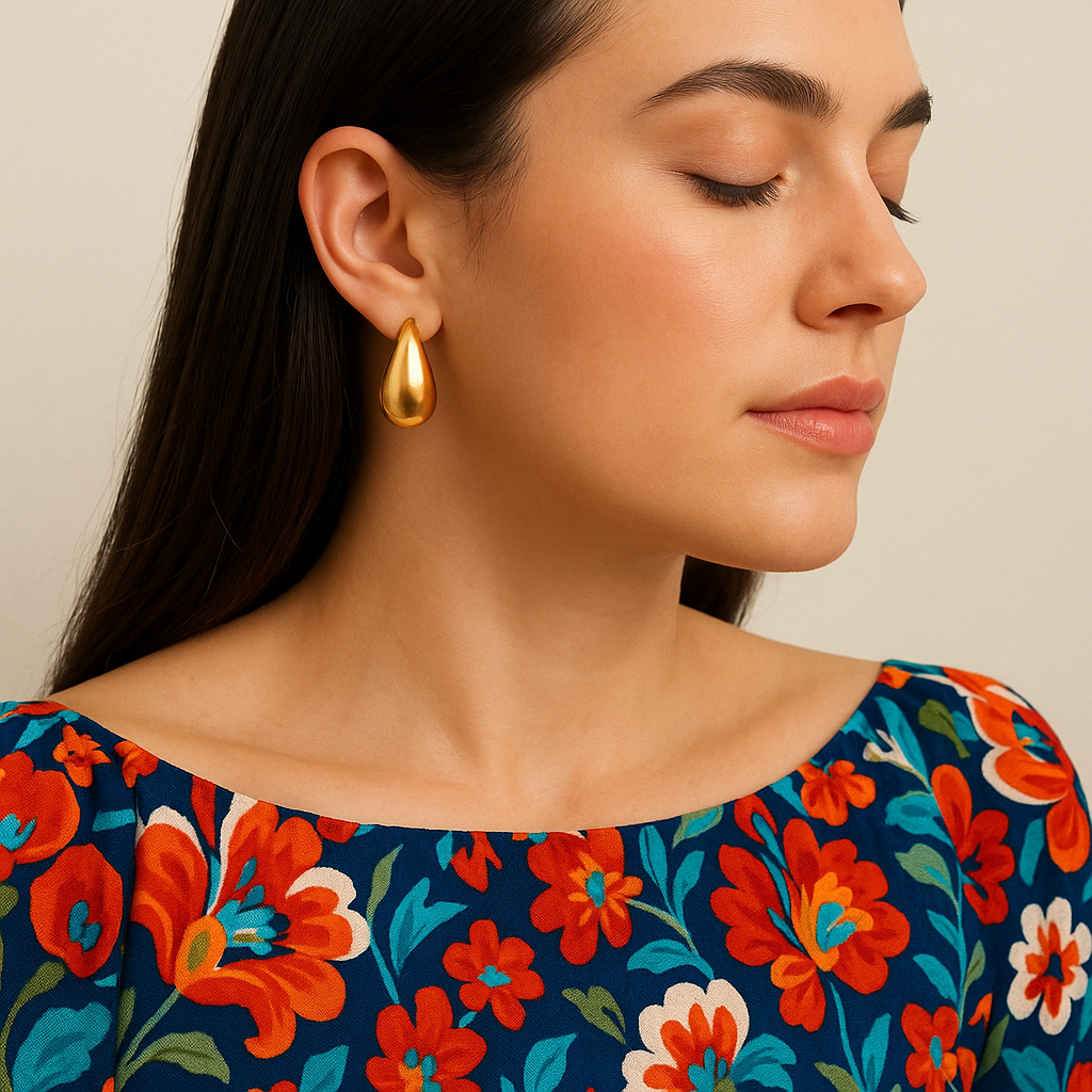
Patterned tops are where earrings go to die. You put on something with a busy neckline, then you add your favorite statement pair, and suddenly your face looks like it’s surrounded by competing flyers. I still wear bigger earrings with prints, but I follow one rule that saved me: match the earrings to the print’s shape language, not the print’s colors.
If your top is full of curves (florals, watercolor blobs, paisley, anything that looks hand-drawn), sharp geometric earrings tend to feel separate from the outfit. In that case I’ll wear a rounded hoop, a teardrop, or a domed button earring. Mejuri-style huggies and medium hoops work because they echo the curve and don’t add a new visual category. If the top is angular (stripes, chevrons, checks, crisp polka dots), that’s when I pull out clean shapes: a flat oval, a small triangle, a rectangular drop. It sounds picky, but in the mirror it reads as “on purpose,” and you don’t get that jittery feeling like your accessories are arguing.
Then I deal with the neckline. Crew neck or high neck plus statement earrings can get crowded fast because there’s no open space. I either do a sleeker earring (a polished hoop, a simple drop) or I pull my hair back so the earrings have room to show up. With a V-neck, you have a built-in clearing, so you can go a little bigger without chaos. Off-the-shoulder is the easiest of all because it’s basically a blank frame. That’s where I’ll wear something bold, even with a loud print.
One practical note: if the print has metallic threads or shiny buttons, keep earring metal quiet. High-polish plus shine-on-the-top is where the whole thing starts to sparkle in a way that looks accidental, not styled.