
Three color moves I use with bags, scarves, and jewelry when an outfit feels like too much but I still want it to read intentional.
The olive trick for when red feels aggressive
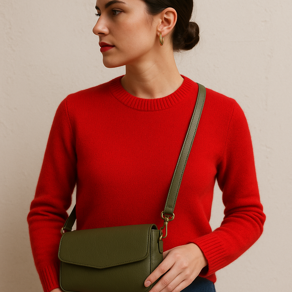
I love red, but I don't love the feeling of walking into a coffee shop and realizing my outfit got there five seconds before I did. When red starts reading as "alarm" instead of "lipstick," I reach for olive. Not bright green, not sage. Olive. It's that slightly muddy, army-jacket green that sits on the opposite side of red without getting cute about it. It cools the temperature down and, weirdly, makes the red look more deliberate.
This is where the accessory choice matters. An olive bag does more work than an olive top because it doesn't fight for space with the red. My most-used version is an olive leather crossbody with hardware that's not too shiny. If the bag has gold buckles the size of a quarter, it turns into a separate statement, and I'm not trying to stage a debate on my torso. Keep the hardware quieter and let the color do the job.
Two easy outfits where I know this works because I've worn them into real days: (1) red sweater, medium-wash jeans, olive bag, and a simple gold hoop. The hoop is there to keep things from going flat, not to win. (2) red lipstick with a black tee and trousers, plus an olive scarf tied close to the neck (think compact, not drapey). The scarf is the key when you want the red on your face to look intentional instead of like you got ready in the car.
If your olive reads too brown in certain light, don't panic and swap to beige. Beige makes red look like it's apologizing. Olive holds its ground. I keep the rest of the accessories plain so the color story stays clear, and I don't end up adding a third mood by accident.
Navy near your face makes bright jewelry behave
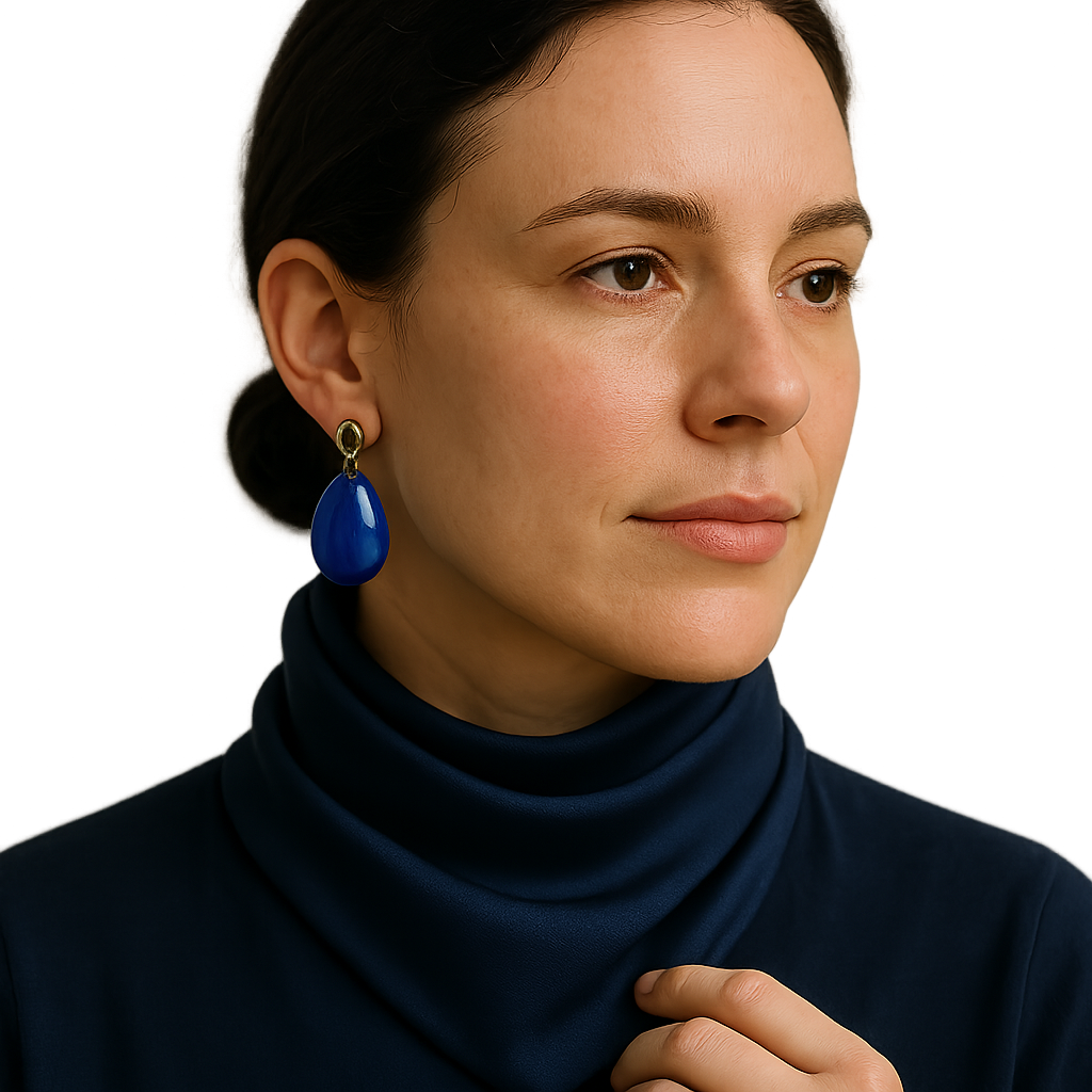
There's a certain kind of bright earring that looks amazing on a tray and slightly chaotic on a Tuesday. For me it's cobalt resin drops, turquoise, anything that reads "pool" at a glance. The fix isn't to stop wearing them. It's to give them navy to bounce off of, as close to your face as you can manage.
I learned this the hard way after trying to make big colorful earrings work with a white button-down. In my head, white was a clean canvas. In reality, it turned the earrings into a floating craft project, especially in daylight. Navy does something different: it deepens the color and makes the shine feel intentional. If black feels too severe, navy is the sweet spot. It looks polished but not like you're headed to a funeral. And it doesn't argue with your skin tone the way stark black sometimes can.
My go-to move is a navy knit top or a navy scarf worn tight enough that it sits in the frame of your face, like a bandanna fold but in silk. Then I pick one bold piece of jewelry and stop. Not "plus a necklace" because the neckline looks empty. Empty is fine. Let the earring be the whole point. If you want a second item, make it tiny and repeating, like a slim ring in the same metal as the earring hardware. That's enough structure without adding another color signal.
When I'm getting dressed fast, I do a quick mirror test from six feet away, the distance a coworker sees you before they say hello. If the jewelry leads and your face follows, you need navy. If your face leads and the jewelry supports, you're good. Navy is the rare color that can act like a filter without making the outfit feel muted or "safe." It just tightens the whole picture.
Tan leather as the pressure-release valve
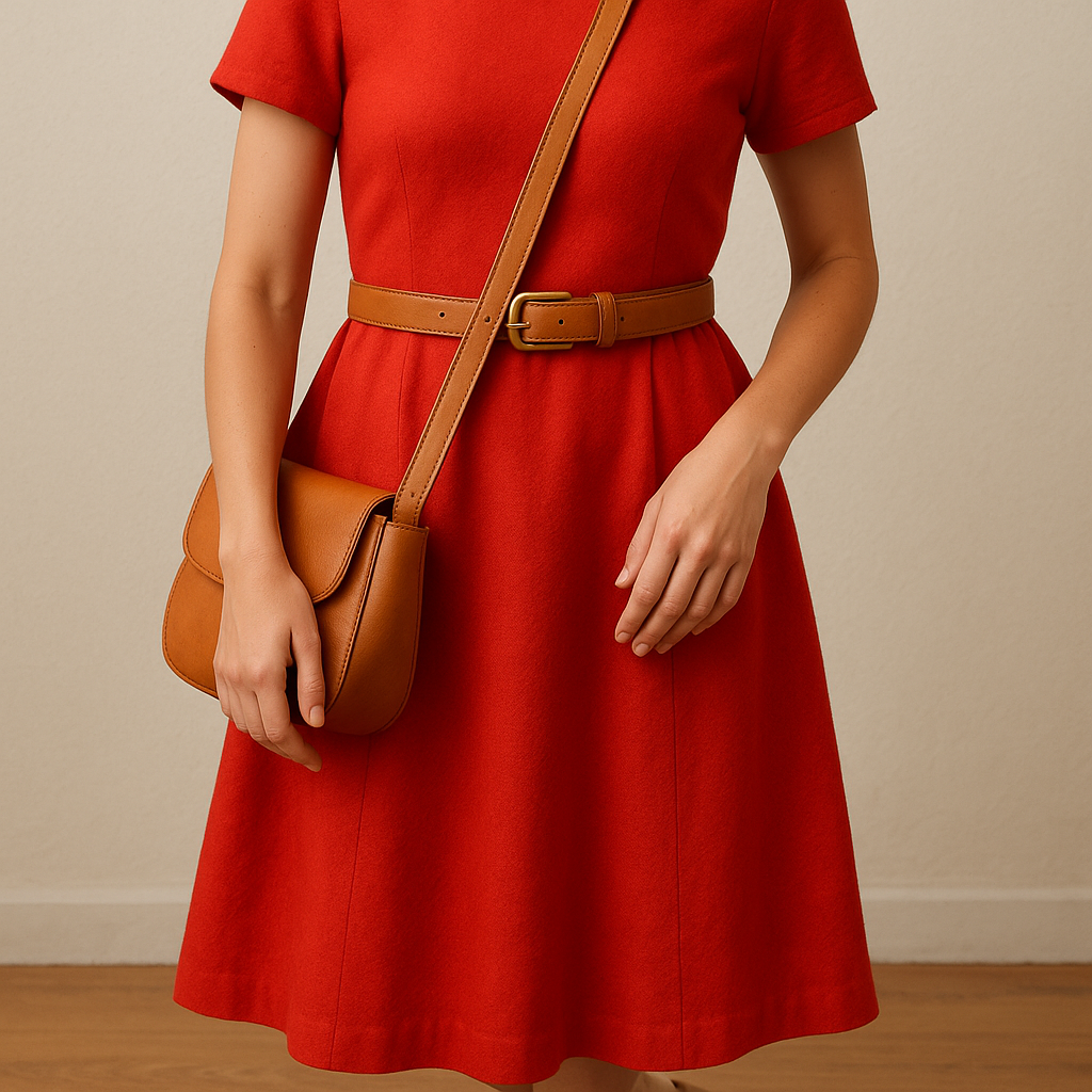
When I'm wearing a lot of saturated color, the thing that saves me isn't another color theory trick. It's tan leather. Not "nude" and not caramel that leans orange. A straightforward tan bag strap, belt, or shoe is like cracking a window in a room that's gotten a little too warm. The outfit still has personality, but it stops feeling like you're dressed for a themed party you didn't know you were attending.
Tan works because it reads as material first, color second. Leather has its own visual texture, and that texture gives your eye a place to rest when everything else is bold. I notice this most with outfits that are already doing a lot: a bright dress, a printed skirt with a loud top, or even just a sweatshirt in a color that screams "look at me". Add a tan belt and suddenly the outfit looks like a choice, not an accident.
Here's how I use it in the real world: If I'm wearing a bright dress, I choose a tan belt with a medium-width buckle, nothing oversized. Then I match it with a tan bag that has a strap that sits flat, so it doesn't cut across the body like a sharp line. For shoes, I keep them in the same family, tan or light brown, and I avoid anything too glossy. Patent leather plus bright color is a lot. If I'm in sneakers, I look for off-white with a gum sole, which gives a similar warm grounding without turning into a "matchy" moment.
The mistake people make with tan is treating it like it's invisible. It's not. If your tan leans too yellow, it can make certain colors look slightly sickly, especially icy blues or cool purples. In that case, pick a cooler light brown, or even a taupe-suede texture. Suede is forgiving because it diffuses light, and you don't get that hard contrast line where the belt hits your waist.
Once you start using tan as the reset button, you'll see it everywhere: the quiet belt that makes a bright blazer feel work-appropriate, the bag strap that makes a saturated outfit feel lived-in. It's the least fussy thing I own, and it does the most emotional work on days when I want color but not commotion.