
Three low-drama patterns (stripe, micro-check, pin-dot) that read clean, not boring, with outfit formulas you can repeat.
The stripe that doesn’t read nautical
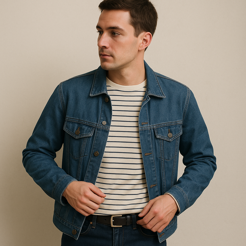
I love stripes in theory and then I put one on and feel like I’m about to sell ice cream on a boardwalk. The fix isn’t “wear stripes confidently”. It’s choosing the stripe that behaves like a solid from ten feet away. My rule: go thin, go even, and keep the contrast low. Navy on cream is the classic, but black on white is where things start getting costume-y fast, especially if the stripe is wide.
Look for a Breton-ish tee where the stripe is narrow (think pencil-line, not referee shirt) and the fabric has some weight so it doesn’t cling and ripple. Uniqlo’s striped cotton tees and J.Crew’s old-school rib knits tend to get this right. The better ones don’t have a big contrast collar, and the sleeves don’t have a separate band in a third color. That banding is what pushes it into “theme.”
How I wear it when I’m trying to look pulled together without feeling like I tried: striped tee, straight-leg jeans, and a clean jacket in a matte fabric (denim jacket, chore coat, or a blazer that isn’t shiny). For shoes, I avoid the obvious boat shoe pairing and go with a simple sneaker like Stan Smiths or a slim loafer. If you want a little interest without adding another print, use texture: a ribbed tee, a jacket with a subtle twill, or a leather belt with a plain buckle. And if your stripe top is slightly boxy, do a half-tuck or tuck fully and let the waistband line do the work. Nothing dramatic, just enough to keep the pattern reading intentional instead of accidental.
Micro-check: the pattern that reads like “grown-up” from across a room
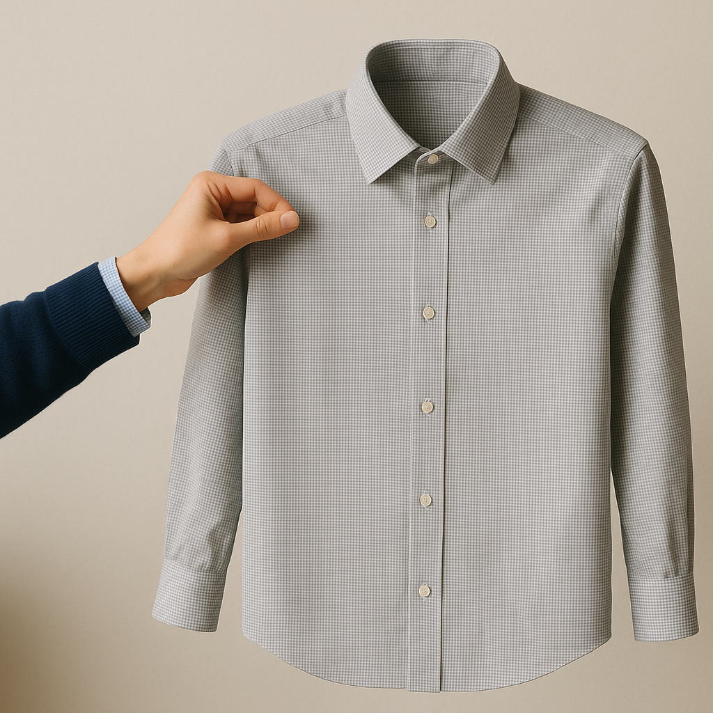
A micro-check is my favorite “I need to look like I have it together” pattern because it photographs like a solid but has enough movement in person that you don’t look flat. Think gingham’s quieter cousin, or the kind of tiny check you see on a Brooks Brothers button-down when you get close and go, oh, that’s why it looks expensive.
The move is scale. If each square is the size of a dime, it’s going to read like a picnic tablecloth. If each square is closer to the size of a peppercorn, the print becomes texture. When I’m shopping, I hold the shirt at arm’s length and squint. If I can still clearly see the grid, it’s too bold for what I’m after. Also: keep the color story boring on purpose. Blue/white, gray/white, or a very soft tan/white is where this pattern earns its keep.
Outfit formulas that don’t require thought: a micro-check shirt under a navy sweater with the collar out (not popped, just visible), or a micro-check tucked into trousers with a plain belt and minimal shoes. If you’re doing the shirt as the main event, keep the rest clean: no loud socks, no patterned tie, no busy bag. I like it with a simple watch and small earrings because the tiny grid already adds detail. One practical note from experience: micro-check fabrics wrinkle differently. The crisp poplins show every bend; the softer oxfords look better rumpled. If you’re someone who ends up with elbows-on-desk creases by 10 a.m., choose an oxford weave or something with a little texture so it stays relaxed instead of looking crushed.
Pin-dots and speckles for when you want “not plain” without the chaos
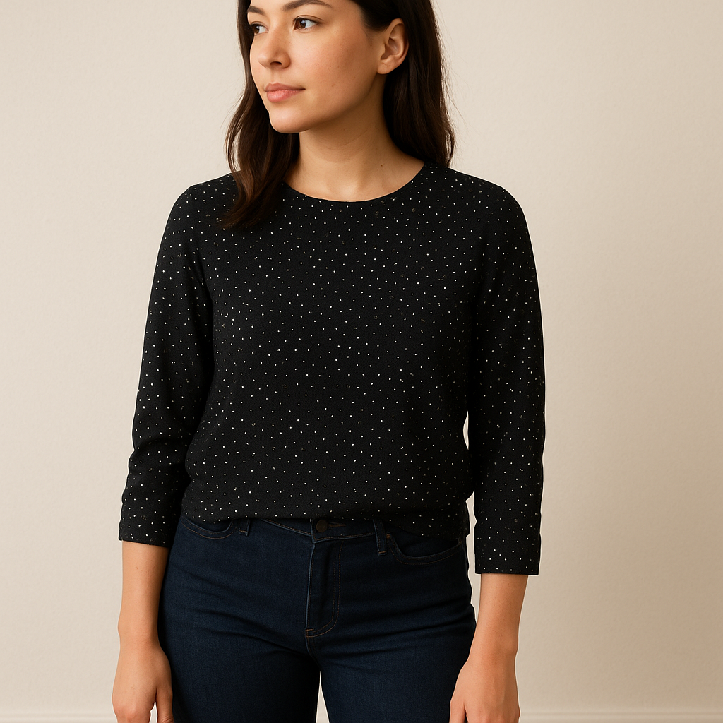
There are days when a plain black top feels too severe, but a floral feels like I’m borrowing someone else’s personality. That’s where pin-dots and little speckles live. They read calm, they hide lint better than a flat solid (the real reason I started buying them), and they don’t fight with your other pieces.
The dot that works is small and slightly irregular, not big and perfectly spaced like a cartoon. I look for a dot that you’d call a “pin” from a few inches away, or a scattered speckle that feels like the fabric got lightly peppered. Everlane and Madewell have both done this well in blouses and tees over the years, and you see it in nicer workwear brands too as a “dobby” texture where the dots are raised rather than printed.
Two ways I use it. First: a pin-dot blouse with dark jeans and a simple shoe when I want to look like I planned my outfit but I didn’t. Keep the blouse streamlined: no huge ruffles, no bow tie neck, no extra drama. Let the tiny motif be the only thing happening. Second: a speckled knit (think black with white flecks, or oatmeal with charcoal flecks) as a swap for a plain sweater. This is the easiest pattern to layer because it doesn’t create that moire mess with outerwear the way bigger prints can. If you’re tempted to add another print, don’t. Add a solid scarf in a single color, or go for a texture change instead, like a suede belt or a leather tote. The whole point is getting that “I have style” vibe without the visual noise that makes you want to change before you even leave the house.